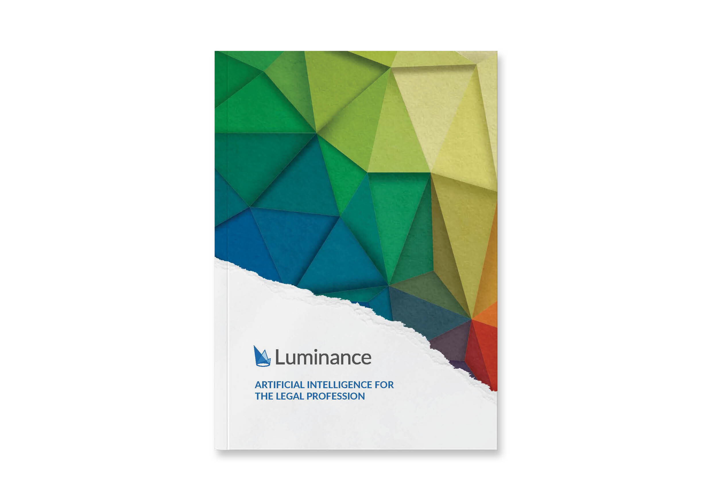


I was approached by Luminance to assist their graphics team in the design and production of the companies main sales and marketing book. My role in the project was to improve upon the design and split the construction work to speed up production.
The Light book incorporates Luminace’s corporate styling of colourful paper craft and legal subject matter.
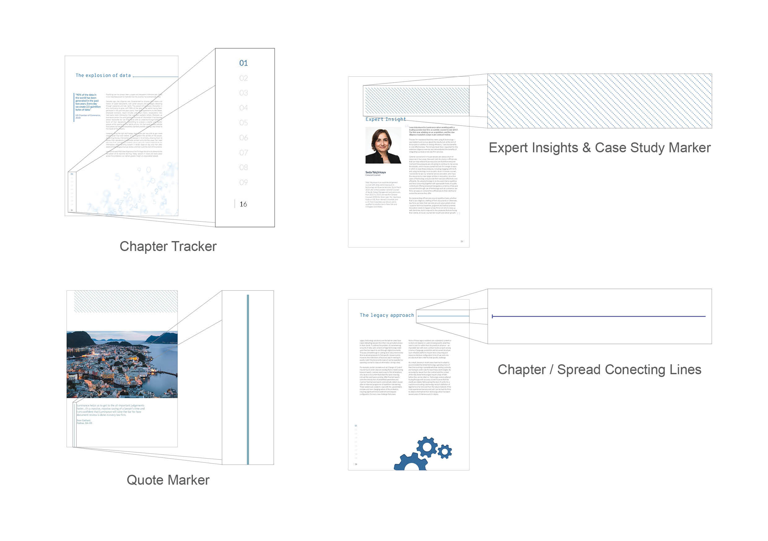
Each section of the Light book is colour coded, which is introduced in each section via a chapter overview containing a paper-craft illustration. Each chapter is tracked with colour coded count down block above the page number on left hand side of each page of the book.
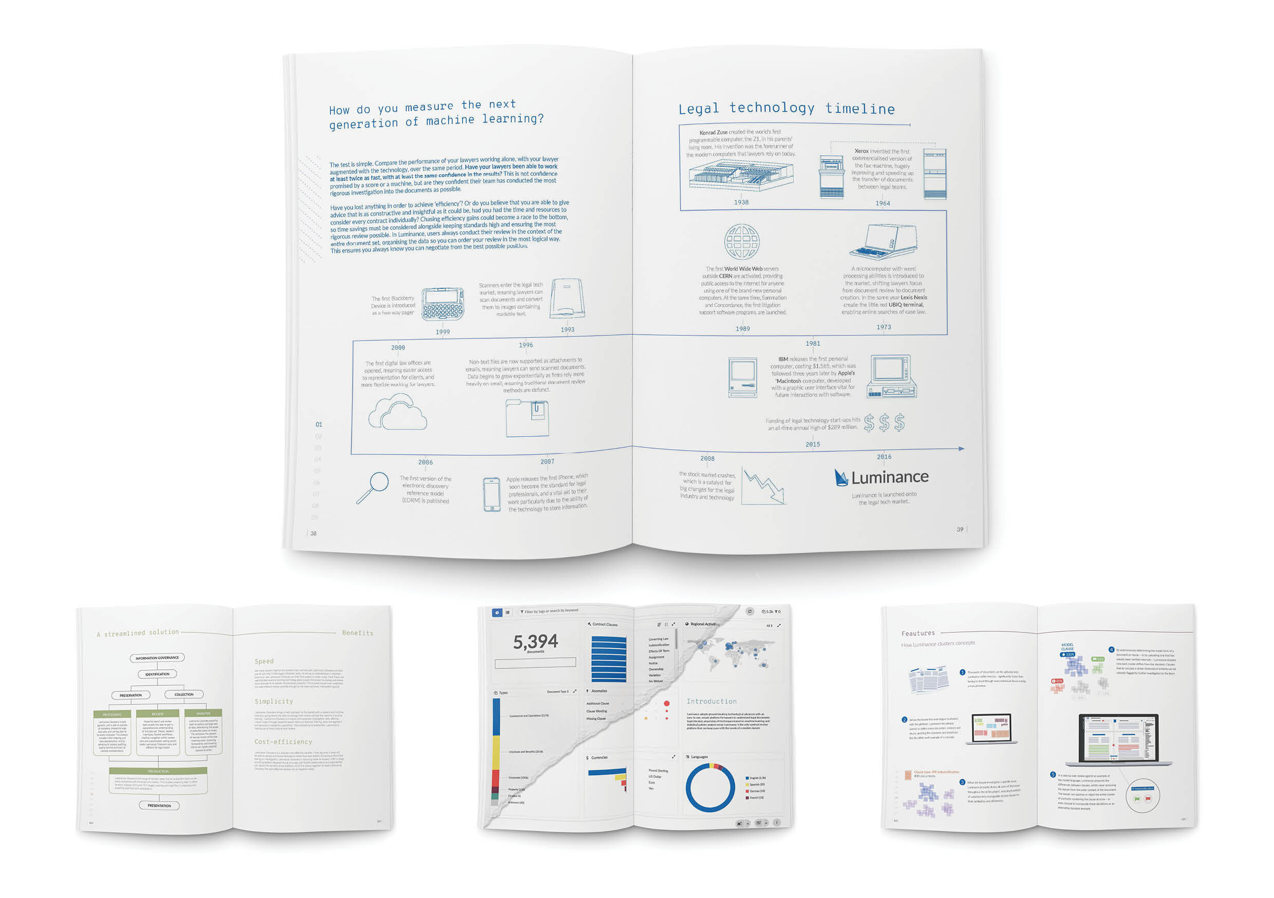
The layout of the Light Book was designed to be adaptive for each section allowing a diverse range of layout solutions, which could be easily changed and adapted on the fly when live copy changes were being made.
Each section of the Light Book contained a feature diagram / design spread which dealt with condensing technical or concept information into an easy to understand manner.
Though out the Light Book there are a number identifying design elements which adapt and change per section, these include: the chapter marker, the quote / key information marker, the hashed ‘Expert Insight’ graphic, and the spread connecting lines.
