

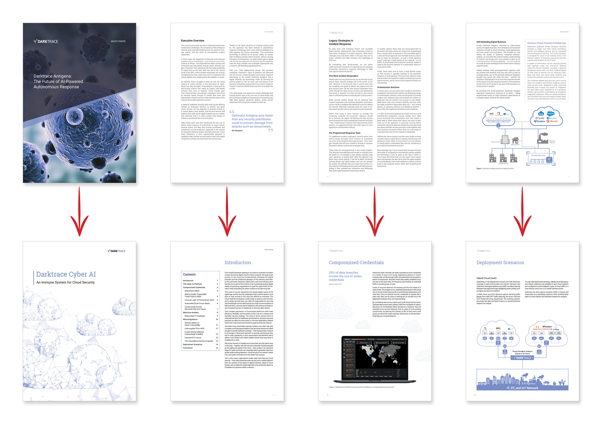


The Darktrace Reports are comprehensive White Papers created around the core Darktrace product suite. Each of the different Reports focus on a different Darktrace product highlighting its effectiveness though detailed explanation of the product, diagrams, and real-world threat stories, accompanied by sanitised (all names and company information redacted) product screenshots of the incidents. This ranged from the weird and wonderful, to the ordinary mundane everyday incidents.
The Reports were classified as a new document type, and were designed to be different from past collateral. The reports used a clean and modern layout with a cohesive structure and flow, which had room for the incorporation of supporting imagery and infographics. A narrative was injected into each report with a subtle watermarked network. This network flowed from page to page, and supported the stories in each section represented.
Each Report was structured with a product overview at the start, followed by sub-sections detailing a range of incident types the particular product dealt with. Each sub-section started with a double page feature spread, with a detailed explanation and full page fictional attack example, complete with supporting imagery. After this, a selection of related ‘real world’ incident stories were included with supporting product imagery, detailing the story.
The Report covers were designed as bespoke wrap around images. The cover imagery was themed around the content of the Report. The imagery was heavily stylised with lines and dots, creating the appearance of a connected network.
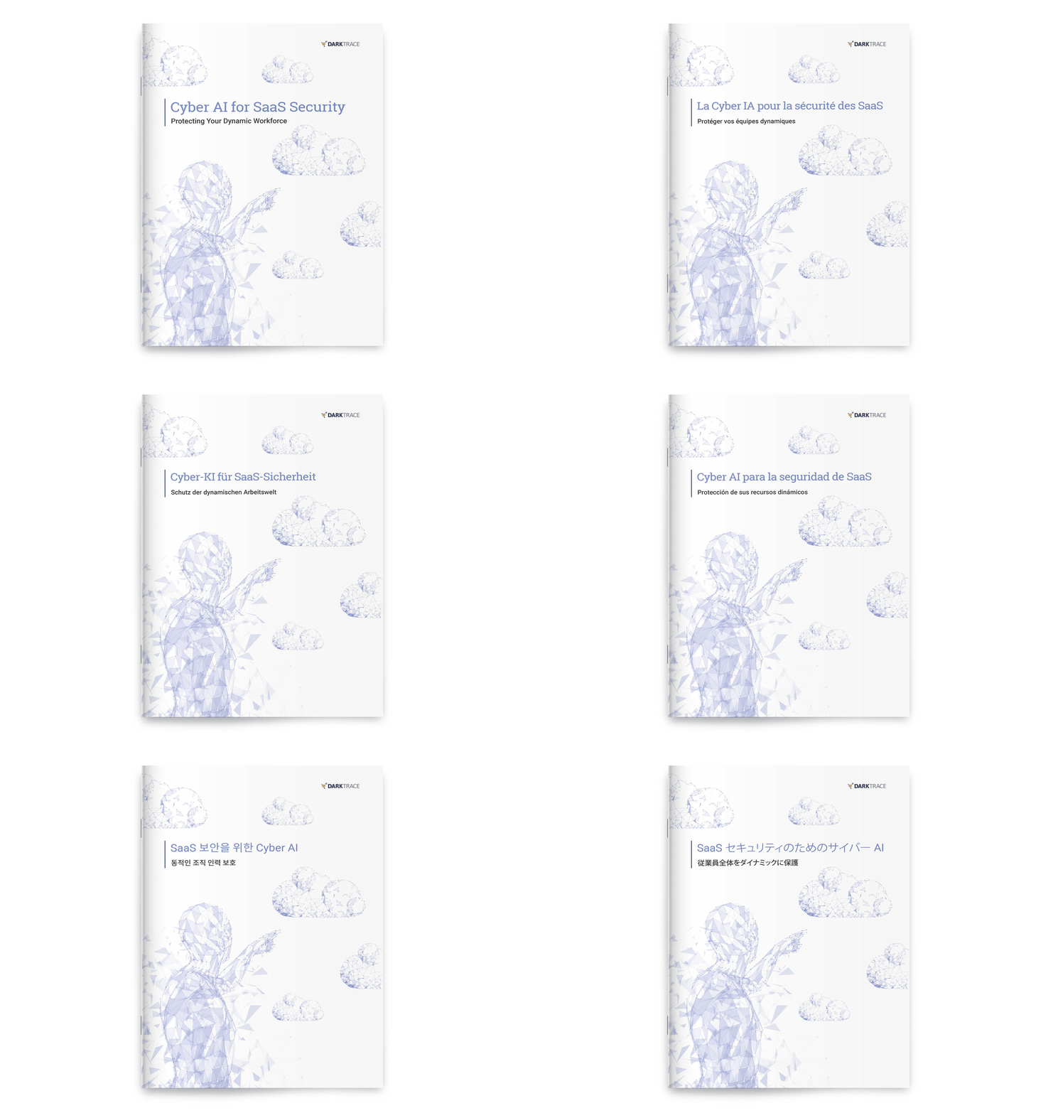
All of the reports were translated for use into the 8 non english languages darktrace operates across. These languages included: French, Italian, Spanish, Portuguese, German, Chinese, Korean, and Japanese. The layout was maintained, with minimal changes to core paragraph styles, to allow for the elongated copy in the translated text.
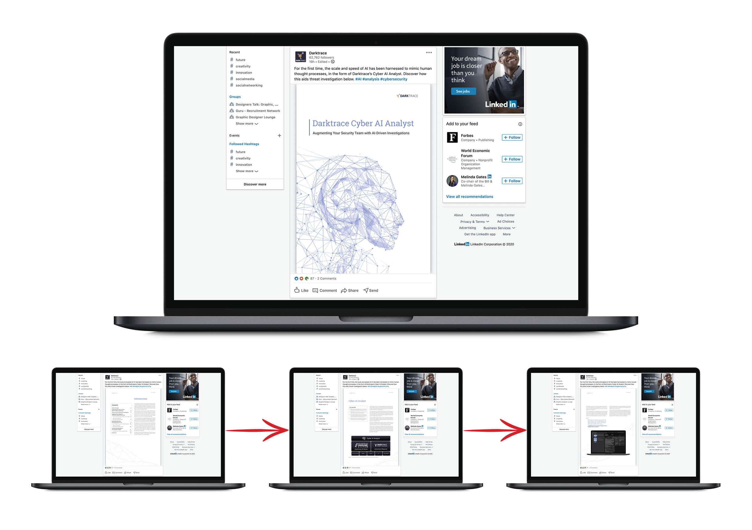
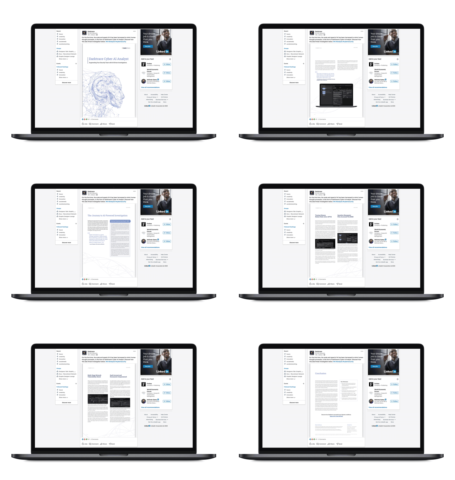
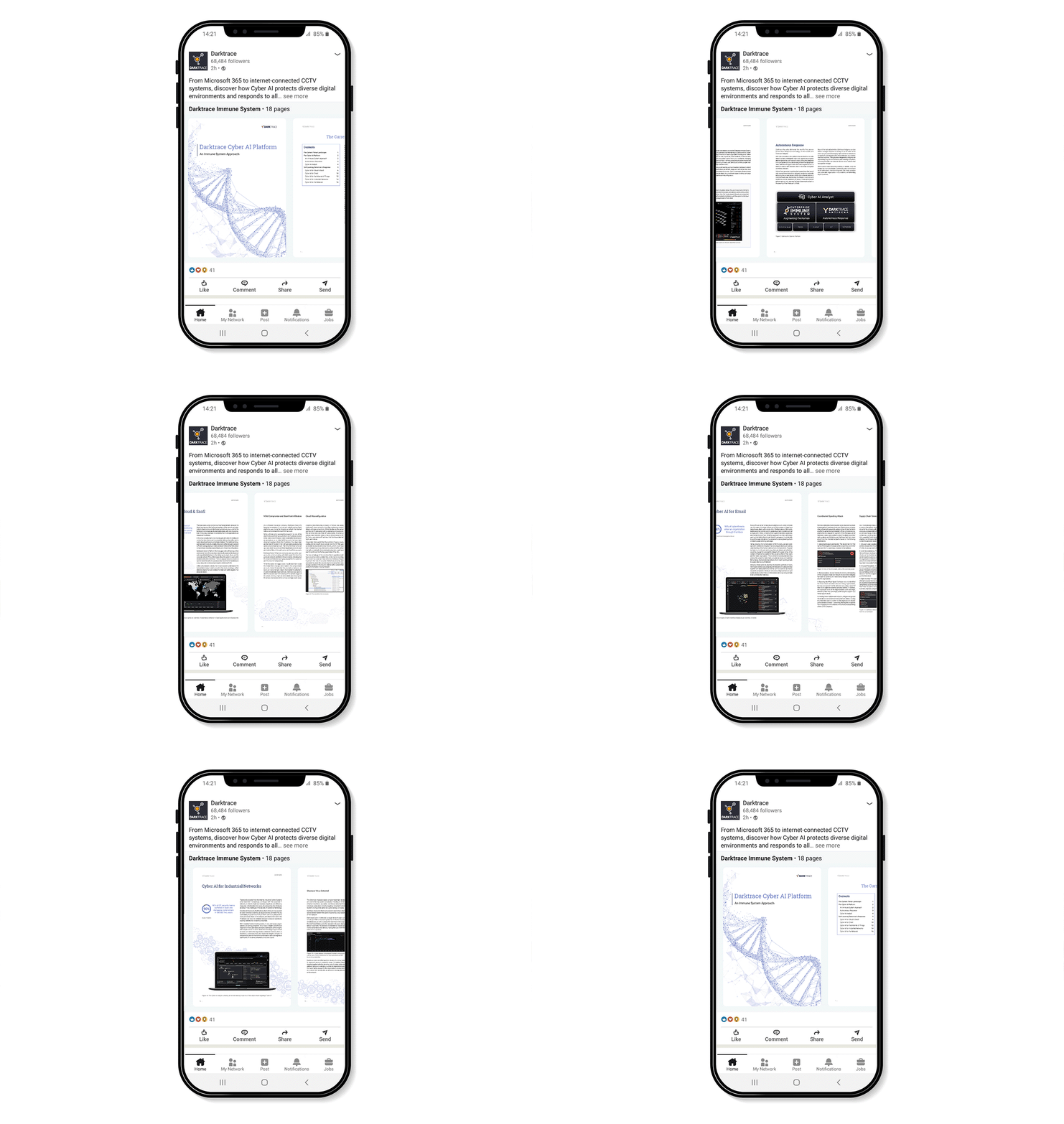
The web versions of the reports were frequently posted and shared on LinkedIn, to support marketing campaigns based around the subject mater of each Report. The viewing platform on LinkedIn allowed the internal flowing network story to visible in the easiest to view format. This was easily viewable on both desktop and mobile view.
